Columbia University
Challenge: Revamp one website; build another
The problem
Columbia Business School’s Global Family Enterprise Program (GFEP) had entered a new era. Recently rebranded, they wanted the look and feel of their web presence to reflect the program’s new attitude and newly defined audiences.
We had one website to revamp and another – their magazine – to create from scratch.
We had three months to make it happen.
My role and the team
As Content Strategist, I led the technical aspects of the project.
I worked with the program director and program manager, with the faculty director offering occasional guidance; toward the end of the project, we were joined by a just-hired copywriter. I also briefly pulled in my team’s programmer.
The program director had done the bulk of discovery regarding their targeted audiences, and she and the program manager had, over the years, created a good 80 pages of legacy content for each website. The program manager in particular had many email blasts to convert into usable content for the GFEP magazine site.
The copywriter worked on optimizing key pages for clarity and SEO.
The faculty director provided some copywriting and final approval.
The programmer helped me locate a handful of taxonomy arguments in a time crunch so I could lay out the corresponding page views differently.
My contributions
- Created how-to documentation
- Completely overhauled and reorganized information architecture on main site, using upgraded (and cuter) content types
- Created information architecture, taxonomy, and navigation on magazine site
- Conducted a content audit, then offered guidance and training on its governance
- Provided some new images
- Incorporated digital accessibility improvements
- Trained program director and program manager on how to update their sites
Results
We met the deadline after managing some emerging fires and blockers. The fresh sites debuted at GFEP’s new Owners’ Day Conference, and all of the feedback that we received was uniformly positive.
Because the sites are so new, and academia moves so slowly, we will need a full year to monitor and completely understand the impact of our work in terms of page views and GFEP newsletter signups. We will be checking the page views and signups every three months in order to monitor. Right now, entering “global family enterprise program” or “gfep columbia” display their main website as #1 on Google SERP. Just entering “gfep” offers nothing relevant – yet. We will check these analytics every three months as well.
Takeaways
My main takeaway from this project was that it was really fun! The four of us found ourselves working very well together, making this project a huge joy, and affirming how easily a project or two can come to life when the vibes are vibing. That work chemistry was what enabled us to move past emerging fires and blockers (such as domain-wide DOS attacks).
My other takeaway was that when it comes to analytics of a product with a very long adoption cycle, benchmarking with established user touchpoints is the way to not get overwhelmed by data. It will be especially interesting to see what happens in terms of page views for GFEP’s magazine website because all of that content is repurposed from a few years’ worth of email newsletters. The program director has open rates from the original email sends, in which the information design was formatted within the constraints of the email platform. I’m excited to follow the web page views when GFEP sends out emails that link to this redesigned and repurposed content.
Before and After: Main Website
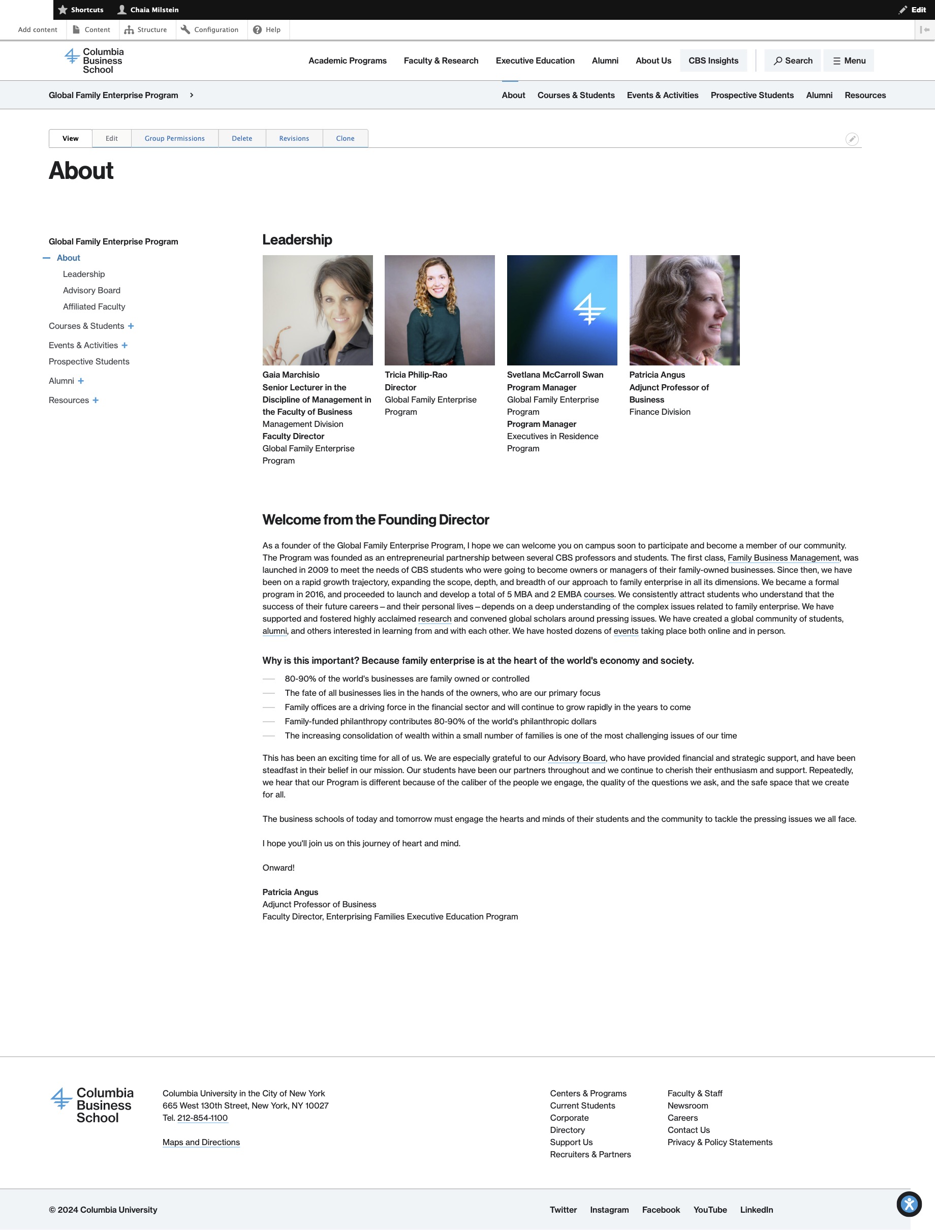
Home Page: Before
Home Page: Before
This version of the Home Page needed to make the depth and breadth of the Program’s offerings clear and obvious right away. It also needed to reflect the voice and tone of the program’s new era.
Home Page: After
Home Page: After
This overhauled version has an eyecatching, relevant hero image; a meaningful tagline; dynamically-imported events; clearly-defined audiences and offerings; and multiple but subtle CTAs. The page now reflects the robustness of the Program.
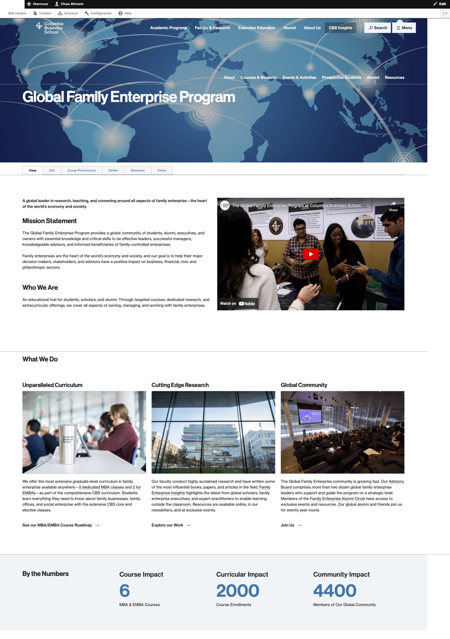
About Us: Before
About Us: Before
The About “page” was actually four different pages: one parent page with three children. Pageviews were sparse on the children pages, so I wanted to condense the information onto one visually compelling page. This image is just the parent page.
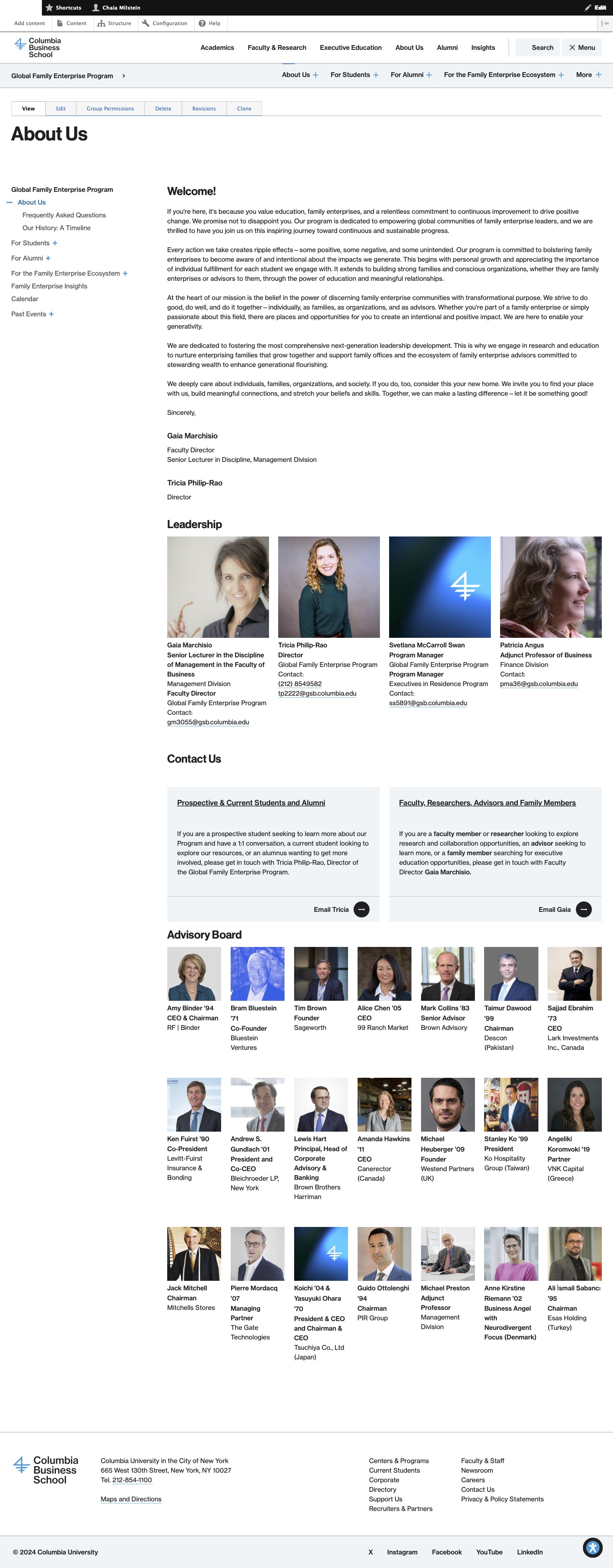
About Us: After
About Us: After
After the top text block, the page is dynamically populated with larger profile photos of the Program’s leadership; clicking on the photos leads to their full profiles. The CTA blocks in the middle of the page break it up visually, and also neatly offer a snippet of information to two specific audiences. Finally, the Board profile photos operate the same way as the leadership ones. They are smaller both because there are so many of them, and also in deference to leadership’s role in operating the Program.
Family Enterprise Alumni Circle: Before
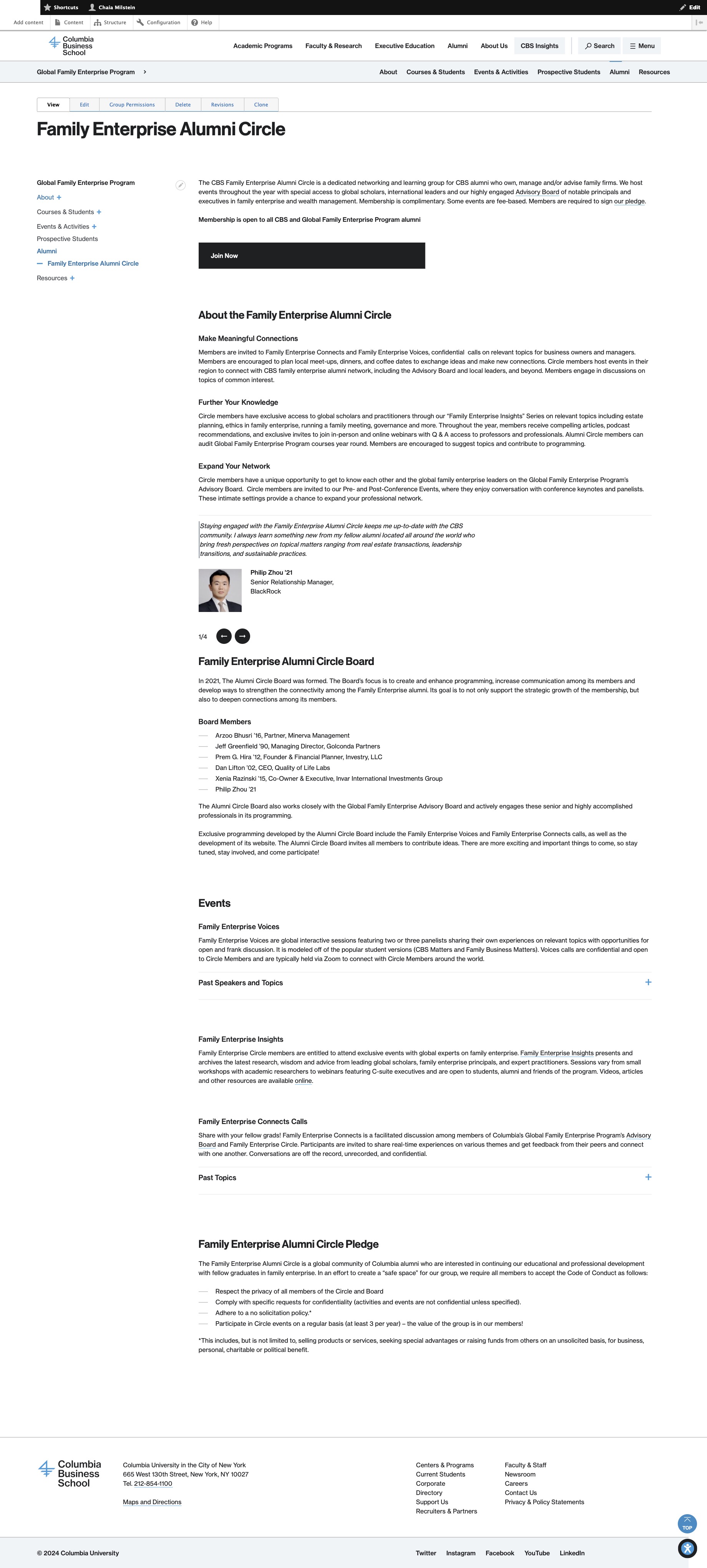
Before: Family Enterprise Alumni Circle
This is just too much text. All of the crucial information gets lost.
Family Enterprise Alumni Circle: After
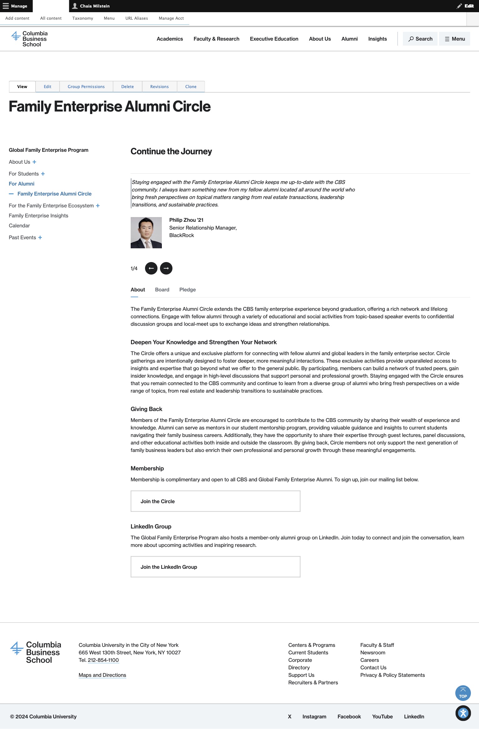
After: Family Enterprise Alumni Circle
Some updated copy makes the page’s purpose clear with a header-as-CTA. Following immediately with the testimonial carousel provides further reasoning for that CTA. The rest of the page’s information appears behind horizontal tabs (About, Board, Pledge), solving the prior iteration’s “wall of text” issue. The page ends with two more CTAs, which further emphasize the page’s purpose.
Before and After: New Website
This is a brand-new website, with content repurposed from the three sets of newsletters that the Program used to send out.
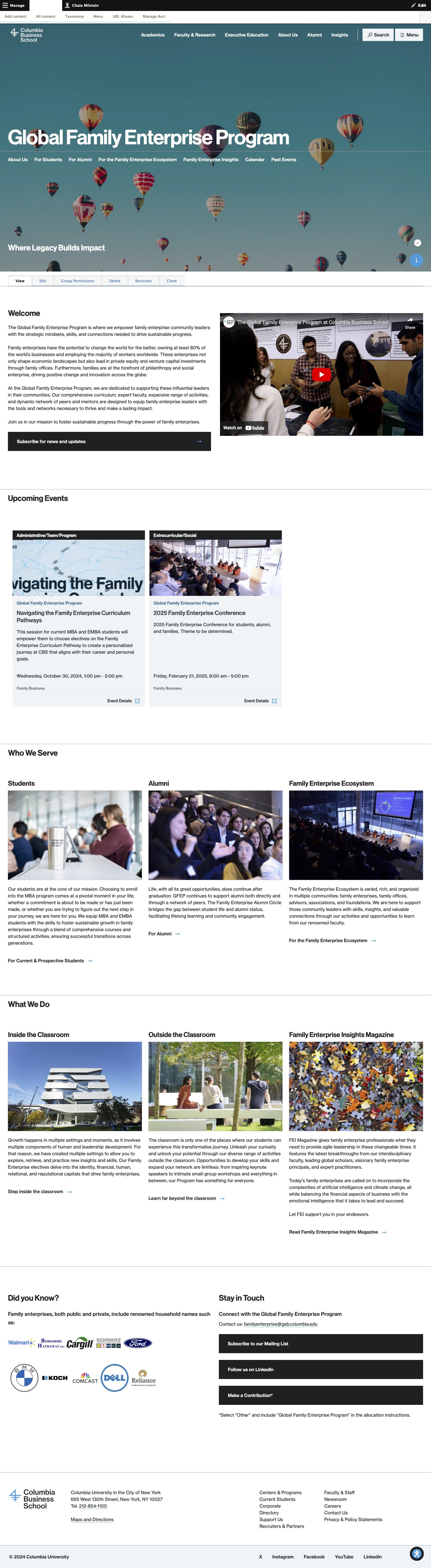
Home Page: New
Home Page: New
The home page of the new magazine website showcases the three most important content buckets right up top: Research Findings, Family Voices, and Practitioner Perspectives. This is to draw in the academic, business owner, and adjacently associated audiences. The other two buckets, Ownership and Entertainment, follow below with searchable fields.
Entertainment Section: Before
Before: Entertainment Section
The Entertainment section used to live on the main GFEP website as a plain text list on one page. Prior to that, each of the pages beyond the links was sent out as its own newsletter, then archived on the email platform. (More below, in Entertainment Page: Before.)
Entertainment Section: After
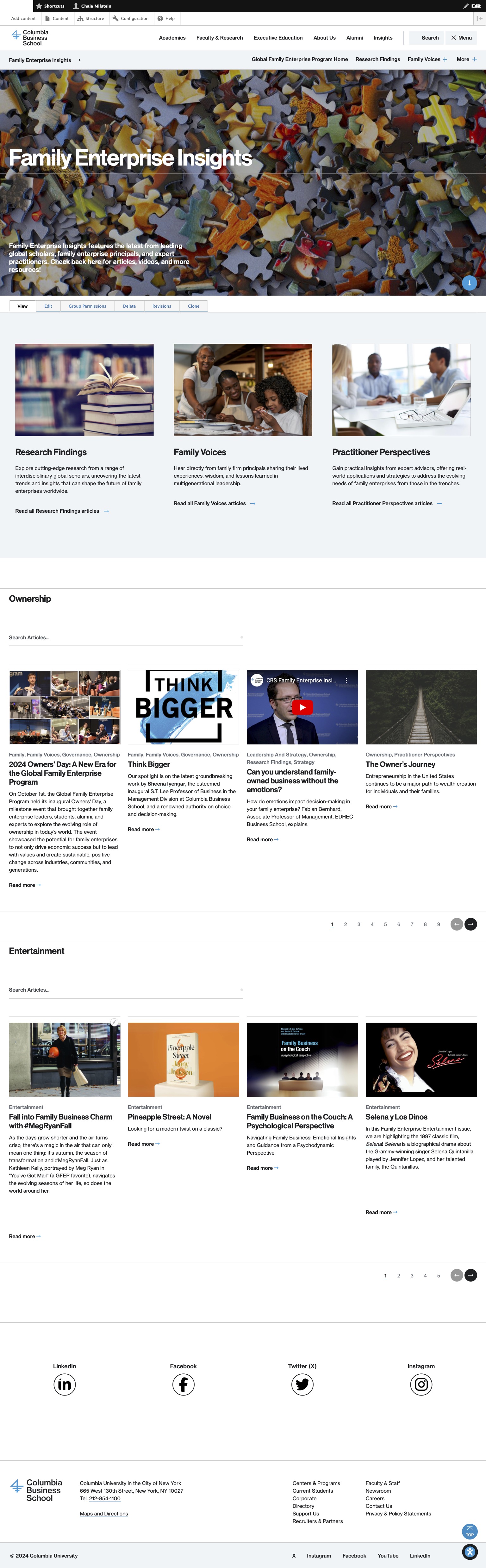
Entertainment Section: After
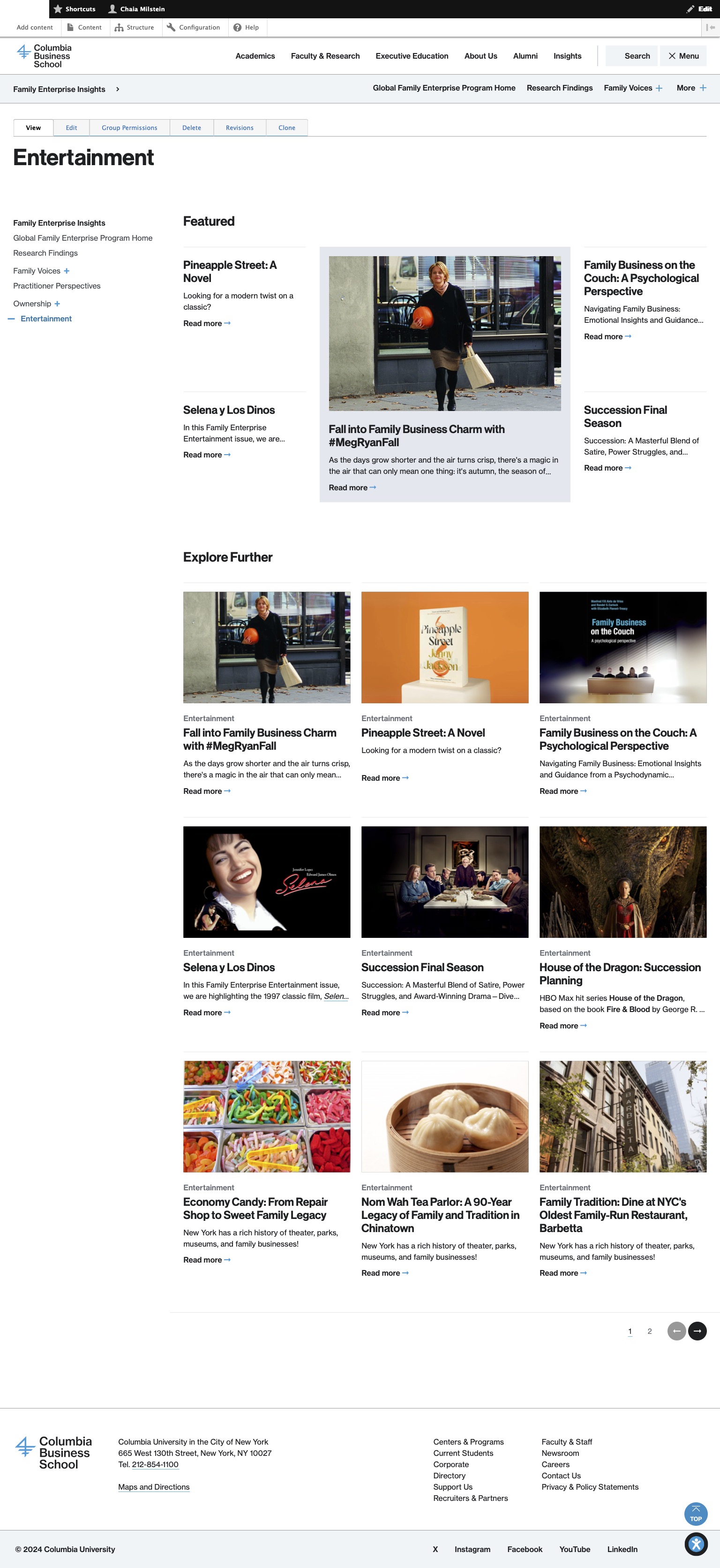
Now the Entertainment listings have a proper section. This page – like all the bucket pages – are organized with a set of feature articles up top, with four small text-only types arranged around one type with an image. The Featured section is manually created, and the Explore Further section below is dynamically created; the top items on the list are the most recently created in the database. This Entertainment section is the new home of content repurposed from those archived newsletters.
Entertainment Page: Before
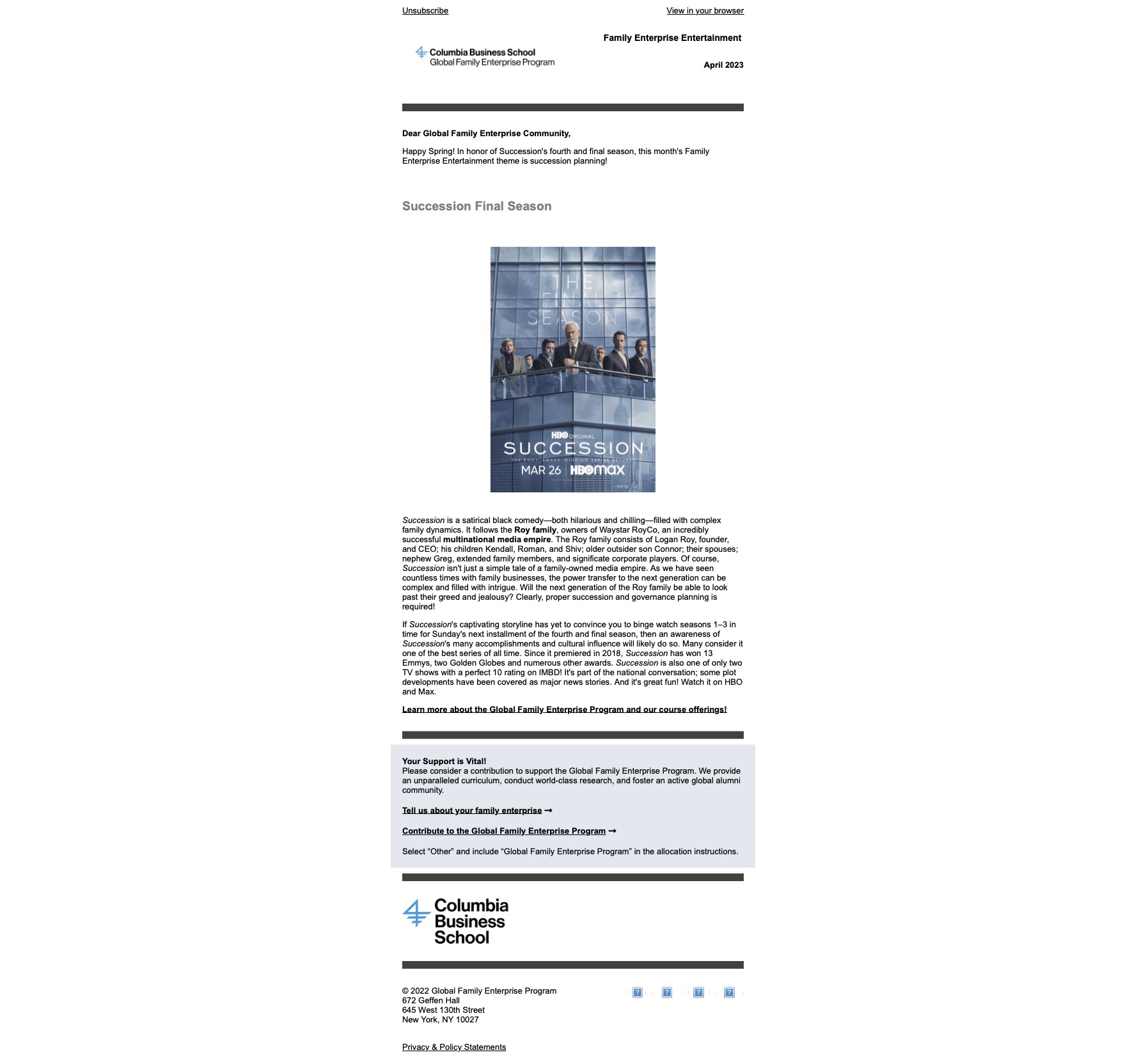
Entertainment Page: Before
An archived newsletter that lived on the newsletter platform itself, needs to live on the School’s website, and could look more vibrant.
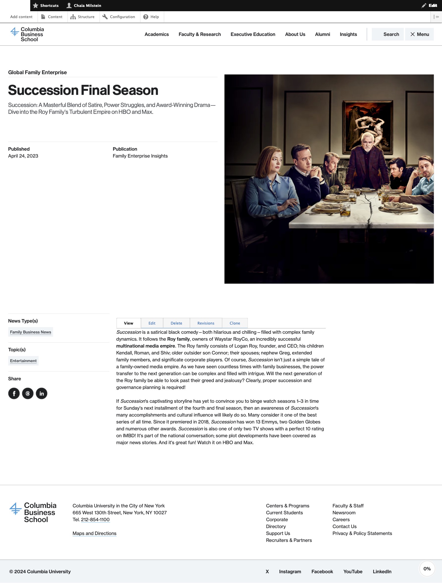
Entertainment Page: After
Entertainment Page: After
From archived newsletter to Article content type. Not only is the page much more exciting, but it is now formatted as an Article type, which means it is tagged. The tags offer an alternative way to gather information within the site. Social media icons make the Article easily shareable.